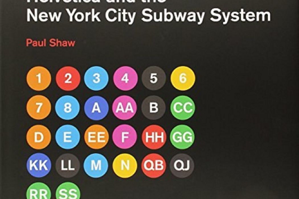
《Helvetica and the New York City Subway System》是2011年2月18日MIT Press出版的圖書,作者是Paul Shaw。
基本介紹
- 中文名:Helvetica and the New York City Subway System
- 作者:Paul Shaw
- 出版社:MIT Press
- ISBN:9780262015486
內容簡介,作者簡介,
內容簡介
For years, the signs in the New York City subway system were a bewildering hodge-podge of lettering styles, sizes, shapes, materials, colors, and messages. The original mosaics (dating from as early as 1904), displaying a variety of serif and sans serif letters and decorative elements, were supplemented by signs in terracotta and cut stone. Over the years, enamel signs identifying stations and warning riders not to spit, smoke, or cross the tracks were added to the mix. Efforts to untangle this visual mess began in the mid-1960s, when the city transit authority hired the design firm Unimark International to create a clear and consistent sign system. We can see the results today in the white-on-black signs throughout the subway system, displaying station names, directions, and instructions in crisp Helvetica. This book tells the story of how typographic order triumphed over chaos. The process didn't go smoothly or quickly. At one point New York Times architecture writer Paul Goldberger declared that the signs were so confusing one almost wished that they weren't there at all. Legend has it that Helvetica came in and vanquished the competition. Paul Shaw shows that it didn't happen that way--that, in fact, for various reasons (expense, the limitations of the transit authority sign shop), the typeface overhaul of the 1960s began not with Helvetica but with its forebear, Standard (AKA Akzidenz Grotesk). It wasn't until the 1980s and 1990s that Helvetica became ubiquitous. Shaw describes the slow typographic changeover (supplementing his text with more than 250 images--photographs, sketches, type samples, and documents). He places this signage evolution in the context of the history of the New York City subway system, of 1960s transportation signage, of Unimark International, and of Helvetica itself.
作者簡介
Paul Shaw is uniquely qualified to have written this account of the development since the mid-1960s of the New York City subway system signage.
He has a BA in American Studies from Reed College and both an MA and MPhil in American History from Columbia University. Trained as an historian, he has spent the past thirty years as a graphic designer specializing in letterforms. At the same time he has continued to research and write design history. He has received scholarships and grants from the National Endowment for the Humanities, the Smithsonian Institution, the Harry Ransom Center at the University of Texas, the American Printing History Association, the Printing Historical Society, and the Book Club of California. In 2002 he was a Fellow at the American Academy in Rome.

